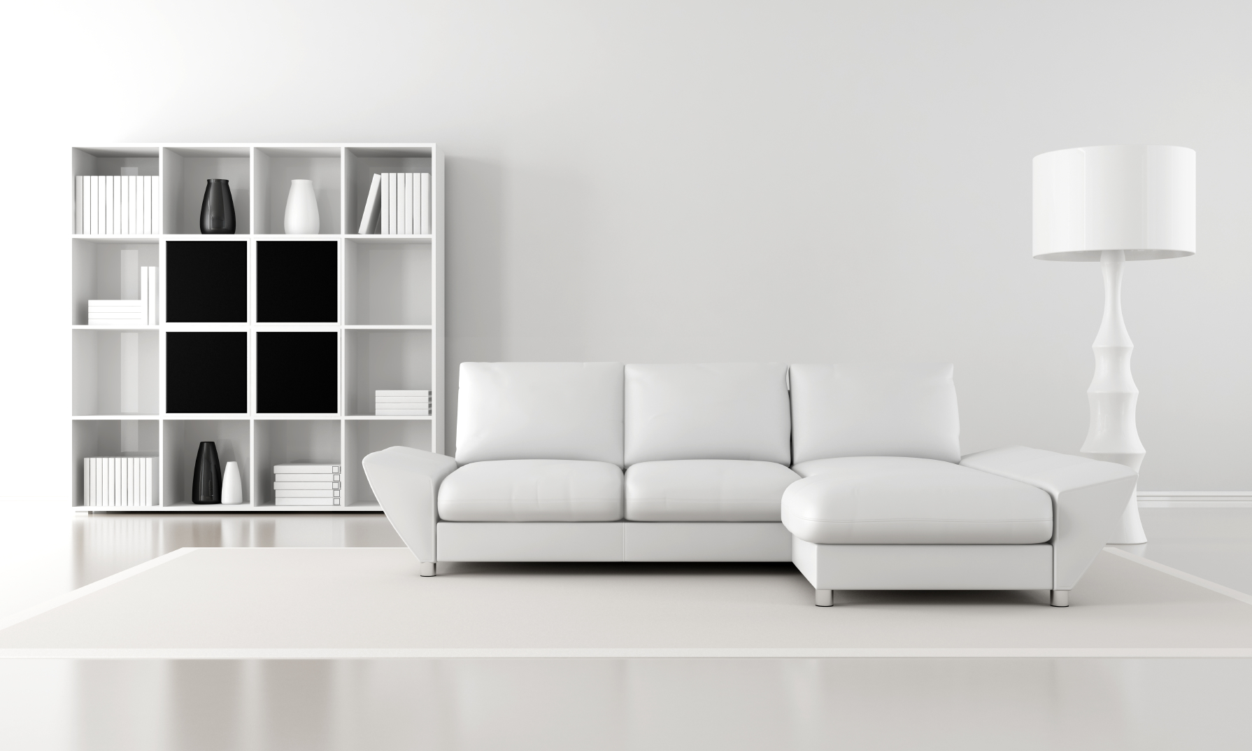
I recently overheard a conversation between a designer and a client regarding room color. When asked about the specific color of a room, the client answered “neutral.”
While I understood what she meant, it struck me as curious that the word ‘neutral’ was used so freely used and that it has become an actual color name!
Neutral by definition is black or white – not a color. When blended into gray, tonal neutrals develop. Technically neutral is an achromatic color, meaning literally that it is a color devoid of color!
I know that the client meant a form of beige or taupe when she responded with the color name “neutral.” Beige has long been the neutral cornerstone and taupe is the new go-to for those in search of a current neutral.
Beige, taupe and any of the colors that are now being marketed as the “new neutrals” are simply colors that play nicely with a large array of other colors. These hues have stepped up to the plate and taken the neutral roll in decorating, but, beware: these “new neutrals” are anything but!
Consider the innocent ivory. It seems innocuous enough to be considered a neutral, right? Well, ivory is a blend of colors that can hold a host of undertones that can creep out when they are least expected and least wanted. Those underlying tones might hold a hint of pink, umber or gold. When those undertones are combined they might show themselves as bluish or peachy.
“Neutrals” that are combinations of a number of hues are loaded with surprises when the paint hits the wall!
Even gray, the current neutral darling of interior design can bite back. If there is any tint beyond the black and white added it will come into play when the walls are painted. Throw in a bit of blue and a touch of magenta and that gray wall just might turn purple!
The gray might be warm, it might be cool, it might read green and it might read blue. While these new neutrals are interesting and give a broader playground for the concept of neutral, don’t assume just because a color is merchandised as such, that it will work with whatever you throw at it!
When neutral is treated as a path to a calming environment, subtle colors and rich backdrops to accent colors, it works. It really is about finding a blend of understated yet sophisticated tones that will allow accent and personality colors to shine! Since the eye can tire of a particular color, a way to incorporate those accent hues is simply by adding temporary items such as a bowl of lemons, a bouquet of peonies, or accent fabrics.
While an accent color sings against the right neutral, adding that focal color it isn’t a hard and fast rule in interior design! Shades of gray mixed with metallics, mirrored furniture, and great textures can deliver as much impact as a room filled with intense colors.
Neutral is often regarded as the safe place to go when decorating. If it is taken to an extreme or done poorly, it can be akin to bland and boring! Consider your reaction at entering a home for sale … a house decorated beautifully will typically be received better and remembered longer than a house that recedes in its neutrality.
I suppose I need to accept the fact that, to the general decorating population, the word ”neutral” means safe with low risk. I get it. This is good as long as that safe decorating haven doesn’t eliminate the counterpoint of rich texture and interesting form and drift aimlessly into an endless sea of boring beige or overdone taupe.


